<< Back to work menu

Hindsight Consulting Historians

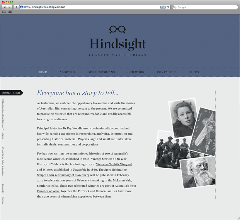
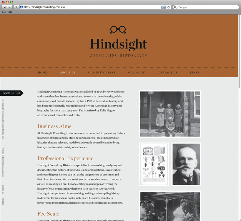
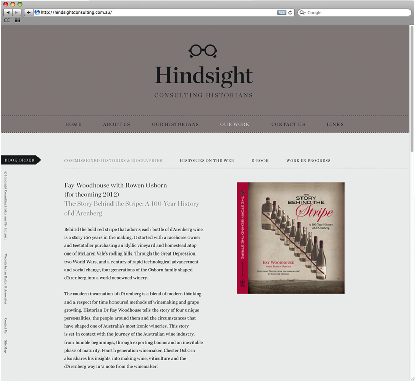
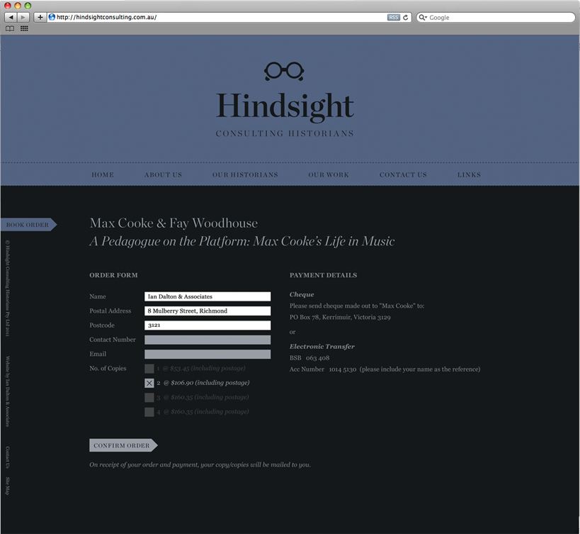
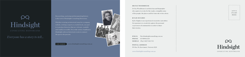
Hindsight Consulting Historians examine and write stories of Australian life. ID was commissioned to develop an identity that was classic and elegant. The logo uses a simple ‘spectacle’ monogram and elegant serif typeface to portray this. The website presents a feeling of nostalgia, and clearly presents the group’s works.

Visit website: www.hindsightconsulting.com.au

<< Back to work menu

John Patrick Landscape Architects

John Patrick Landscape Architects were looking to revive their company image, and wanted a rigorous style guide that kept all communication looking consistent. ID refined the logo incorporating all of the sectors that are now encompassed by the firm, and developed a definitive style that was applied to all of their communication platforms. A website was also designed to showcase their impressive portfolio of landscape design projects.

This website is still in its construction phase.

<< Back to work menu

Garden Design Fest

Garden Design Fest is a biennial open garden event run by Kew Rotary club. Around 30
professionally designed private gardens are open to the public over a single weekend, with the
unique opportunity to meet designers at their gardens. All proceeds of the event go towards
selected charities. ID have designed a fresh brand identity, including a ‘content managed’ website
for the event.

<< Back to work menu

HEAC

HEAC is a Melbourne-based electrical contractor. Running just 4 people strong, they have the capability to ‘punch above their weight’ undertaking jobs of commercial and industrial size. Their identity needed to feel strong, tough and resilient, and show that they were serious contenders against the larger lectrical companies. The logo takes on a stencil-like quality, as the electricians had normally used a stencil to spray paint their logo onto completed work as a means of branding and leaving contact details. ID designed both a logo and a website for the company that reflected these key characteristics.

This website is still in its construction phase

<< Back to work menu

Lisadurne Hill Grove

Lisadurne Hill Grove are a new small olive grove in Victoria. ID under the direction of Kerry Cross of Imagefx was commissioned to design a label for the range of olive oil produced by the grove. The labels shown here are at concept stage.

<< Back to work menu

Ted’s

During Ian Dalton’s time as Marketing and Advertising Manager at Ted’s Camera Store, he was responsible for the design and art direction of the store’s new iconic logo. The concept was to present a friendly face to the company along with bold ‘technical’ typography. The very skilled illustrator, George Haddon, was an obvious choice to capture the warmth of ‘Ted’. The Lubalin typeface, new and fresh at the time, was ideal to depict the expert technical advice offered by Ted’s Camera Stores. A trusted household brand had arrived!

<< Back to work menu

Classic Moves

Classic Moves are a group that specialises in relocating seniors and elderly individuals to new homes
and retirement villages. ID created a brand identity that was simple and clear, and reflected the
caring nature of the group.